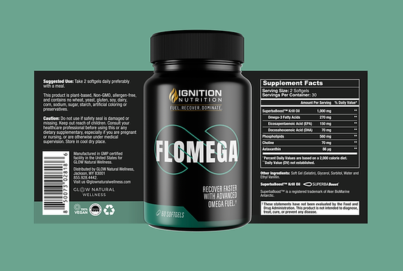
Ignition Nutrition Launch
BRANDING & PACKAGING SYSTEM
Brand creation and packaging design for Ignition Nutrition, a new extension of Glow Natural Wellness developed to target a male, performance-driven audience.
The project focused on translating the brand’s holistic foundation into a stronger, more aggressive visual language aligned with fitness culture — combining bold typography, symbolic graphics, and a high-contrast color system.
brand concept
Ignition Nutrition was built around the idea of activation and performance.
The logo symbol was developed from the distortion of the letters I and N, forming a flame — representing energy, ignition, and transformation.
This concept is reinforced by the brand’s core message: Fuel. Recover. Dominate.




packaging visual system
BOLD, HIGH-IMPACT SYSTEM, DESIGNED FOR:
GYM ENVIRONMENT VISIBILITY | FAST PRODUCT RECOGNITION
STRONG SHELF PRESENCE | MASCULINE-CODED PERFORMANCE CUES

BLACK BASE FOR CONTRAST AND INTENSITY

OVERSIZED TYPOGRAPHY FOR IMMEDIATE READABILITY

SYMBOL-DRIVEN PRODUCT DIFFERENTIATION
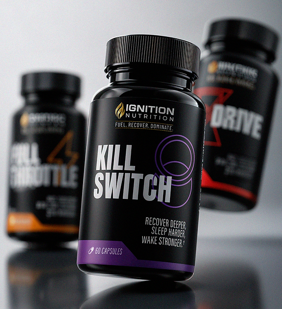
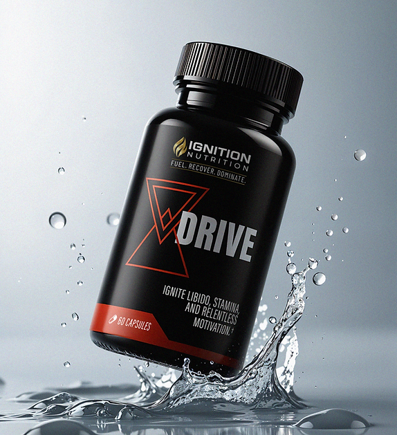
HIGH-SATURATION ACCENT COLORS PER PRODUCT
MINIMAL, IMPACT-FIRST LAYOUTS FOR FAST VISUAL SCANNING