The Balmb Launch
PACKAGING | VISUAL DIRECTION | DIGITAL | MARKETING
The Balmb is a natural topical cream designed to support joint and muscle recovery.
Developed for Glow Natural Wellness, the product introduced a new opportunity for the brand: connecting its existing wellness positioning with a more performance-driven audience.
brand concept
HOW COULD A PRODUCT DESIGNED FOR RECOVERY SPEAK TO A NEW AUDIENCE WITHOUT LOSING ITS CONNECTION TO THE GLOW BRAND?
Glow Natural Wellness had traditionally focused on women's wellness, particularly products related to menopause and hormonal health.
The Balmb opened a different territory: muscle recovery, joint support and fitness performance, with a stronger appeal to a male and active audience.
The challenge was to create something bolder and more performance-driven, while still feeling like part of the Glow ecosystem.

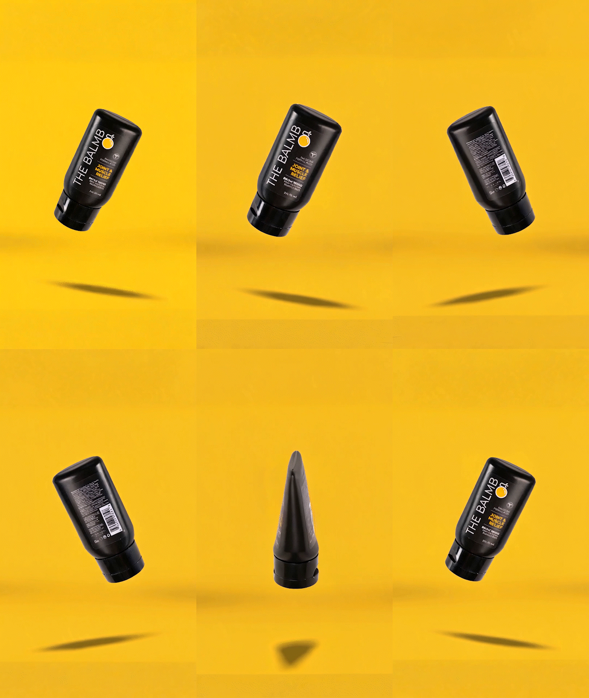
The packaging became the starting point for the new visual direction.
A compact black tube creates a strong physical presence, while oversized typography and yellow accents make the product immediately recognizable and reinforce its performance positioning.
The design also maintains Glow's visual DNA through its typography, minimal composition and clean information hierarchy.


product infographics
The visual system was extended into a series of product infographics designed to communicate the formula, benefits and positioning of The Balmb in a clear and engaging way.


CONVERSION FLOW:
PRODUCT INTRODUCTION → INGREDIENTS → BENEFITS → SCIENCE → TARGET AUDIENCE → LIFESTYLE → BRAND VALUES

digital experience
The product identity was translated into the digital experience, creating a product page that combines education, benefits and brand storytelling.
The content structure moves users from desire to understanding to trust, balancing lifestyle imagery with functional information, ingredients, usage and brand values.